According to Phil Lord and Christopher Miller, they wanted the film to feel like the viewer had “walked inside a comic book,” and were excited about telling the story in a way they believed the live action films could not.Persichetti concurred, feeling that animation was the best medium to honor the comics, allowing the production team to adapt 70-year-old comic art techniques for the film’s visual language. It boasted the largest animation crew that Sony Pictures Imageworks had ever used for a film.
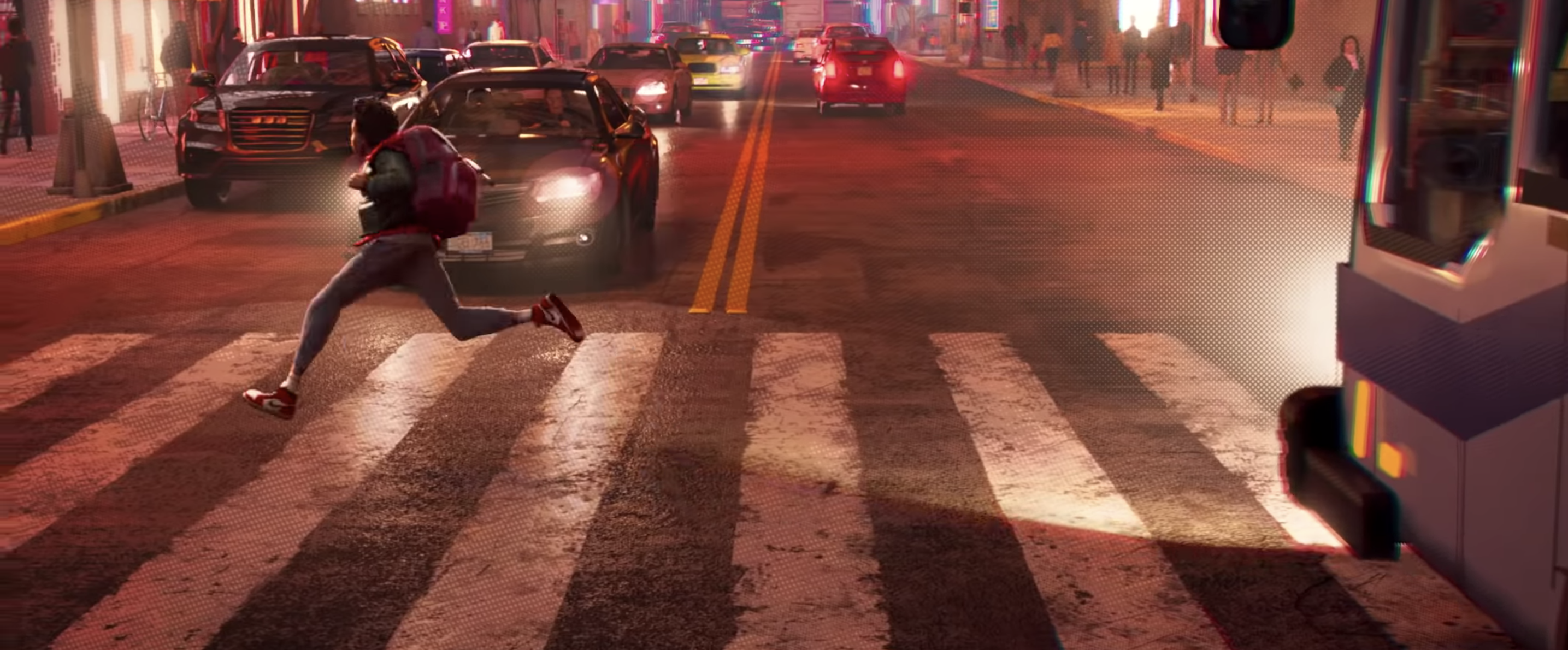
The CGI animation for the film was combined with “line work and painting and dots and all sorts of comic book techniques,” to make it look like it was created by hand. This was achieved by artists taking rendered frames from the CGI animators and working on top of them in 2D, with the goal of making every frame of the film “look like a comic panel.” To make the film feel more like a comic book, it was animated without motion blur, instead using an older technique called motion smearing. The frame rate varied, making the animation “crunchy.” Sometimes, two frame rates would be used in the same scene; early on, Miles was animated at 12 frames to show his inexperience while Peter was animated at 24 frames to give him smoother movement. To create depth of field, another technique was used: deliberately misaligned colors, as if the colors had been slightly misprinted as happens with ink printing in real comics. Other methods to make the film look more like a comic were halftones and Ben-Day dots to create colors, tones and gradients, crisscrossed lines to create texture and shadows, Kirby Krackle to create the illusion of energy, motion linesto show movement, and onomatopoeia, words on the image, to represent sounds and motion.
Rather than using animation principles like squash and stretch, the animators came up with substitute versions, “so that in texture and feel it felt different, but it still achieved the same goal—to either feel weight or anticipationor impact or things like that.” Different comic styles were emulated throughout the film for the different characters, with Spider-Gwen’s animation based on the designs in her comics, Spider-Man Noir having a black-and-white color scheme, and Spider-Ham being designed as “cartoony” as possible. Animation co-director Patrick O’Keefe said that committing fully to each Spider’s unique art style was like “making five movies.”
The directors all felt that the film would be one of the few that audiences actually “need” to watch in 3D, due to the immersive nature of the animated world created, and the way that the hand-drawn animation elements designed specifically for the film create a unique experience.